I want to share the full technical expectations for this project so we’re completely aligned from a design + print-production standpoint.
These designs are being recreated specifically for DTF printing on tees, so decisions around distress, edges, ink coverage, and shadows are intentional and functional, not just aesthetic.
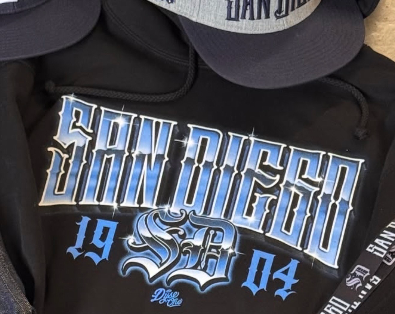
Please reference the attached image (San Diego example) — this is exactly the look the client is asking for and should be treated as the primary visual guide.
1. Overall Design Direction
Big, bold typography that reads clean on a shirt
Strong letterforms with enough weight to survive distressing
Chicano / West Coast–inspired style
No thin strokes or overly delicate details
2. File Delivery Requirements
3. Ink Coverage & Opacity Target
This is important for both feel and wear.
Target approximately 75% ink coverage overall
Ink should not be fully solid or opaque
Allow fabric to show through naturally
Goal is a soft hand feel and breathability, not a heavy plastic print
Screen-print–inspired approach, even though this is DTF
4. Distress & Vintage Treatment
Distress is purposeful and controlled.
Break up ink coverage in a consistent, intentional way
Vintage wear should feel authentic and worn-in, not digital
No random noise or harsh grunge textures
Design should remain bold and legible first, distressed second
5. Edge Treatment (Faded / Feathered Edges)
Use subtle faded / feathered edges to avoid hard ink cut lines
Edges should soften naturally into the fabric
Letter structure and shape must remain crisp
No blur, glow, or artificial softening
6. Shadow Treatment (As Shown in Reference Image)
Include a subtle outer shadow around the letterforms, as seen in the reference
Shadow should add depth and separation from the shirt, not heaviness
Shadow must remain soft and understated so it doesn’t increase ink density too much
The shadow should also respect the distressed/vintage treatment
7. What We’re Avoiding
Over-inked, glossy, heavy prints
Sticker-like edges or ultra-clean vector perfection
Effects that don’t translate well to fabric or wear
8. Scope, Demo & Pricing Structure
I’ve recently acquired a contract with a clothing company totaling approximately 50 designs.
To ensure creative and technical alignment, I’d like to start with a paid demo:
If the demo is approved and the client is happy with the result:
After the initial 10 designs are completed and approved:
This structure allows us to confirm alignment upfront while creating a clear path for consistent, scaled work.
I’ll send over the remaining reference images next so you can see exactly what needs to be replicated and adapted for DTF.
9. Confidentiality / NDA
As part of this project, an NDA will be in place.
All artwork, source files, and recreated designs are confidential and may not be resold, reused, shared, posted, or claimed as personal or portfolio work.
Please do not state or imply that you created these designs publicly or privately all work is produced strictly as work-for-hire for this client.
I’ll send over the remaining reference images next so you can see exactly what needs to be replicated and adapted for DTF.
Let me know if this works for you and how you’d like to proceed.
This is the first design
Best,
...
Show more